Ready to launch Facebook ads, but don’t have a graphic design background? These Facebook ad design tips will help you learn how to captivate your target audience and get results from your ads.
Click on an item below to jump ahead to a specific tip:
Continue reading below to learn about all of the tips above, as well as to see some great examples of eye-catching Facebook ads.
If you want to learn more about advertising on social media, give us a call at Relevantly. We have over 15 years of marketing experience helping small businesses achieve their goals.
13 Facebook Ad Design Tips
1. choose your ad format
The very first thing you’ll need to do when you are creating a Facebook ad is select what type of ad you’ll be running.
You can’t accurately design an ad unless you know this information, as each ad format will have different visual requirements!
The most popular Facebook ad formats include:
Single image ads: Just as the name states, this type of ad includes one large image with captions and headline text.
Carousel ads: A carousel ad is a form of picture ad that showcase a number of photos. Users can scroll through to see each one.
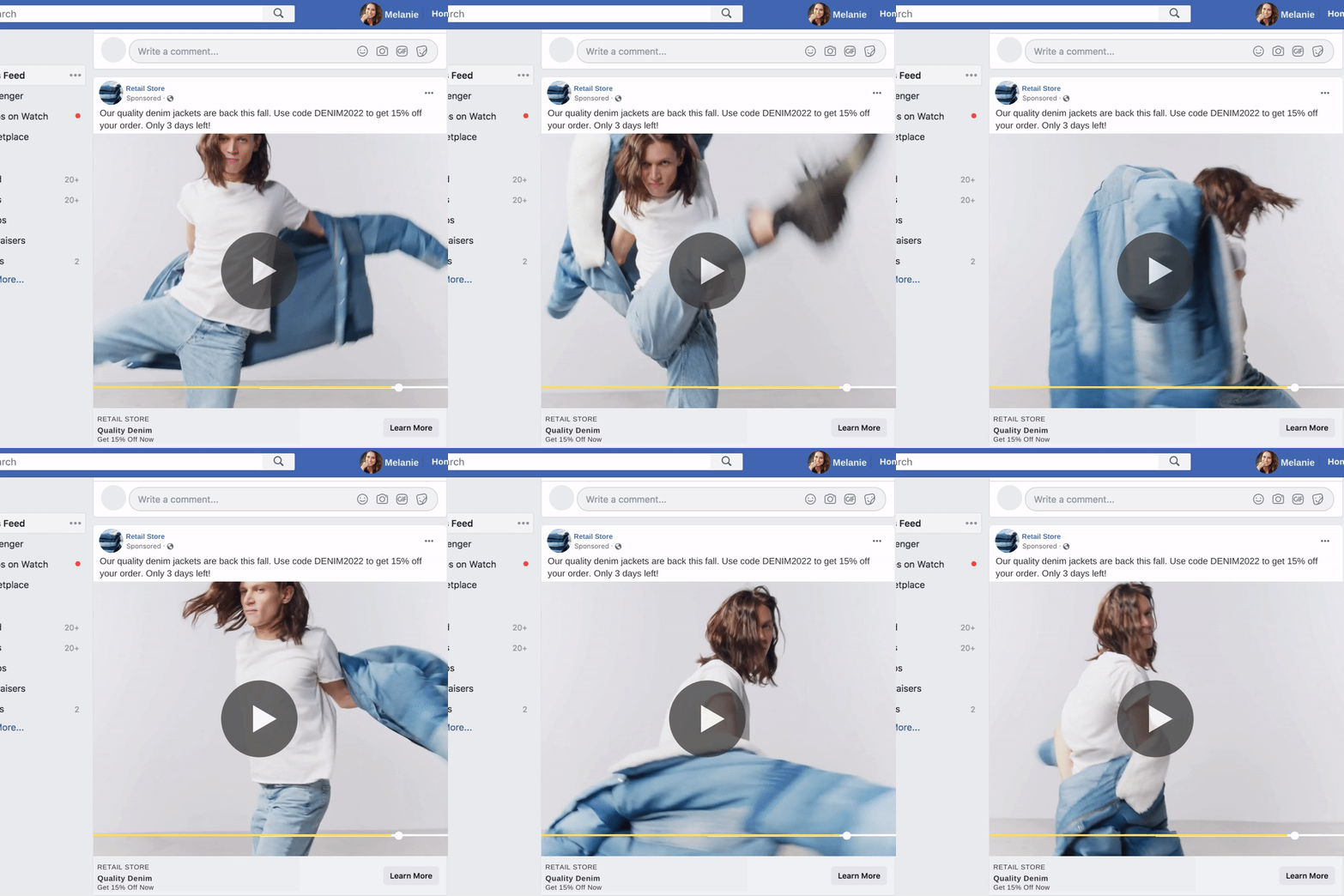
Video ads: A video ad is formatted just like any video on Facebook, but is sponsored. A video box will appear, and you can watch the ad. Usually, video ads are fairly short - just a few minutes or less.
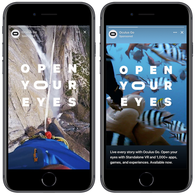
Stories ads: These are very short video ads (just a few seconds long) that appear in the “Stories” section on Facebook. They are formatted the same as an Instagram Stories ad. They are best viewed on a mobile phone.
Each type of Facebook ad type has both pros and cons. Image ads, for example, are the easiest to design.
video ads are a great way to capture attention
They are simple, and if you don’t have a lot of design or copywriting experience, they are a good way to begin. However, they tend to get less engagement than video ads, on average.
Video ads, on the other hand, tend to get more engagement. By nature, a video is a bit more eye-catching and can tell more detailed stories or provide more information about a product or brand.
However, creating a video ad is much more complicated and requires more skill to do it right.
If you are just starting out, we recommend trying your hand at single image ads and Stories ads first, as they will be the easiest to design and run.
2. Get Familiar With Canva
Canva is an amazing, free, online tool that allows you to create high-quality graphics for both personal and professional use.
Canva is known for being user-friendly, so even if you don’t have previous design experience, you can get started and make something great without any formal design training.
That being said, graphic design is a skill. Even with great tools like Canva that make this skill easier and more accessible to learn, you will still have to put some work into creating beautiful and effective ads.
Check out the awesome video below to learn more about how you can use Canva to make great ads.
If you don’t have graphic design experience, Canva is an excellent choice
Canva provides users with a variety of free templates to help them make beautiful graphics for social media posts and beyond.
It also has a wide range of fonts to choose from and free stock images as well as backgrounds, gifs, graphics, and so much more.
3. Choose Unique Visuals
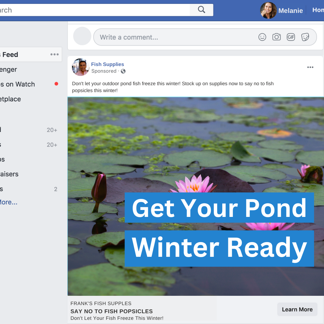
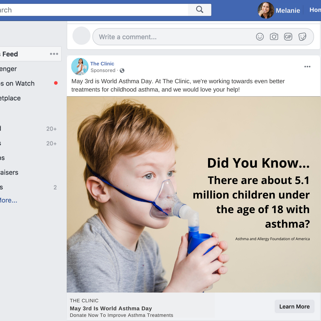
Take a look at the two ads below. They both have the same headline text, CTA button and ad format. Which one caught your attention?
Using unique imagery can help capture attention
While both of these ads are fairly well designed, the ad on the right uses humour and unique imagery to help capture attention.
Now, you may very well like the look of the ad on the left better. However, it’s been shown that using unique, funny, and sometimes even silly ads can really help improve not only clicks to your site but also engagement.
And engagement is great because it means that people are willing to speak with you about your products and brand, and that allows relationships to form.
4. Be Selective With Fonts
When designing a Facebook image ad, you may want to include some text right on the image to help showcase some important information, a sale, certain dates, etc.
However, it’s important to choose the right font(s). When it comes to fonts, less is more! While you may be tempted to choose that fun handwritten font, or ultra-bold choice that grabs your attention, it’s always best to stick with fairly simple choices.
And remember, don’t use more than two fonts! Pairing a bunch of different fonts together hardly ever looks good - and when it does, it’s usually because a very experienced designer put it together.
Carefully select your fonts to ensure your ad looks professional
If you do want to use fun and unique fonts, like in the example above, make sure that they are still very easy to read. Don’t overdo the text on your image - a few words at most are probably your best bet.
Keep font colours simple too, black and white is almost always the best choice for the inexperienced designer.
If you’re looking for some timeless fonts that look great on almost everything, check out this guide from Saxon Print & Design.
5. Consider Ad Placements
As you learned earlier in this article, there are a variety of different ad styles and types to choose from.
In addition to that, there are a number of places where your ads can appear, on both Facebook and Instagram. This is called ad placement.
Knowing where your ads will appear and how they will be placed will help you decide on a final design. This is because some ad placements are quite small!
So, for example, for smaller, sidebar ads, you wouldn’t want to design an ad that includes text your potential customers won’t even be able to read!
Learn more about ad placements in this informative video
The video above will teach you more about Facebook ad placements, how to choose placements, and how to ensure your ads are designed for the types of placements that Facebook offers.
6. Include Obvious Calls-To-Action (CTAs)
Calls-to-action (CTAs) are a super important part of all marketing materials. They are what help your customers (and potential customers) know what to do next if they are interested in your product or services.
Take a look at this real Nike ad below for a great example of an effective CTA and headline text.
This ad is simple yet eye-catching, you instantly know what it’s about - there’s the obvious Nike “swoosh” in the first image, clear pictures of their product, and a simple headline: “The gift that’s always in style.”
A good ad isn’t pushy - it tells you what it wants you to do in a more subtle way. Instead of saying “Buy this gift for your kids now!” it tells you that, yes, this is a great gift idea, and it’s a great choice any time.
Then, when you look at the bottom of the ad, it says “Give Sport” as the short tagline. Another subtle CTA that helps the viewer connect this product with an idea - the idea that these kid’s shoes will help encourage healthy activity and participation in sports.
Then, finally, we have the CTA button - “Shop Now” - instead of a “learn more” button, this button tells readers that you can buy this product right now.
This ad is simple yet highly effective. It communicates its main message using fewer than 15 words and a single image.
It shows that using calls-to-action can feel natural and not pushy. You just have to take a bit of time to think about how you want to word it.
7. Make your ad super clear
Did you know that the average person scrolls through 300 feet of mobile content per day?!
That’s a lot of scrolling. And it’s often pretty mindless scrolling too, meaning that social media users aren’t always reading every single thing or watching every single video that pops up in front of them.
A lot of scrolling is…well…scrolling past things that don’t interest them. That’s why it’s super important to make sure that your ads not only stand out, but that they are very clear.
Use easy-to-read fonts and clear imagery to capture attention
You want to ensure that your target audience knows exactly what they are looking at right away and what your main message is.
Here are some design tips for doing just that:
Ensure you use relevant, clear, high-quality imagery
Use large, easy-to-ready fonts
Consider using gifs to help tell a simple story
Don’t include too much headline text - keep it succinct
Use attractive colours that complement each other
Use statistics or interesting facts to make your ad stand out
You likely only have a few seconds to grab a user’s attention before they scroll on by to the next post or video.
As you design your ad, do a “3-second test” yourself - close your eyes, and then open them for 3 seconds to view your ad. Close your eyes again.
What stood out to you? Was your message clear? If the answer is no, then you may want to tweak or redesign it.
8. Carefully Craft The Body Text
We’ve talked a lot about ad design up until this post. And while that’s important, ad copy is super important too!
While your ad’s graphics will probably be what helps your ad stand out and gets users to actually pay attention to your ad, you’ll want to make sure that when they get to the ad copy, they are just as interested as when they first saw your video or post.
There are a lot of things to consider when it comes to ad copywriting. This is another important skill that a lot of people don’t have. However, nearly anyone can write ad copy with a bit of practice and research.
Check out this great video below that will give you an introduction to writing high-quality, effective copy for Facebook ads.
Learn how to write ads that grab user’s attention
Copywriting is a skill - that’s why it’s often a job you’ll see within marketing agencies. It does take time, effort, and practice to get right. But if you have the time and the passion, you can make beautiful ad copy for your own business.
If you don’t have the time to learn this skill, consider working with a professional marketing team. There are agencies that will work very closely with you to ensure that your voice and your company’s messages are clearly and effectively communicated in all of your ads and marketing materials.
9. Design a Landing Page
When looking for new customers on Facebook, creating an effective and attractive ad is only the beginning. When you click on most ads, they will take you to a company’s website - a landing page.
Sometimes, for product ads, the landing page is simply the shopping page that showcases the product you clicked on with options to customize and buy.
For services, landing pages can be a bit more complex. However, it is important that no matter what you are advertising, you have a carefully curated landing page that matches the “vibe” of the ad.
This is important because it creates consistency for the user, and that makes them more likely to stay on the page.
Source: Nike.com - Nike Pico 4
Remember the Nike ad we showed you above? This is the landing page for that ad. See how similar it is to the ad?
For another example, let’s say you saw a product ad for a pair of pants. If you click on the ‘shop now’ button, you would expect to be taken to the product page, right? However, what if you were taken to the home page? or the contact form? You would likely just leave the website feeling frustrated.
A great landing page looks and feels similar to the ad. If your ad is about landscaping services, your page should be very obviously about landscaping services too.
You can help tie your landing page together with your ad by doing a few simple design choices, such as:
Including the same headline text on both the ad and page
Including the same visuals on both the ad and page
Using the same colours and fonts on both the ad and page
Writing similar text/messages on both the ad and page
If you don’t have experience with web design, you may want to work with a professional to help you design an attractive and functional landing page on your company’s website.
10. carefully choose your colours
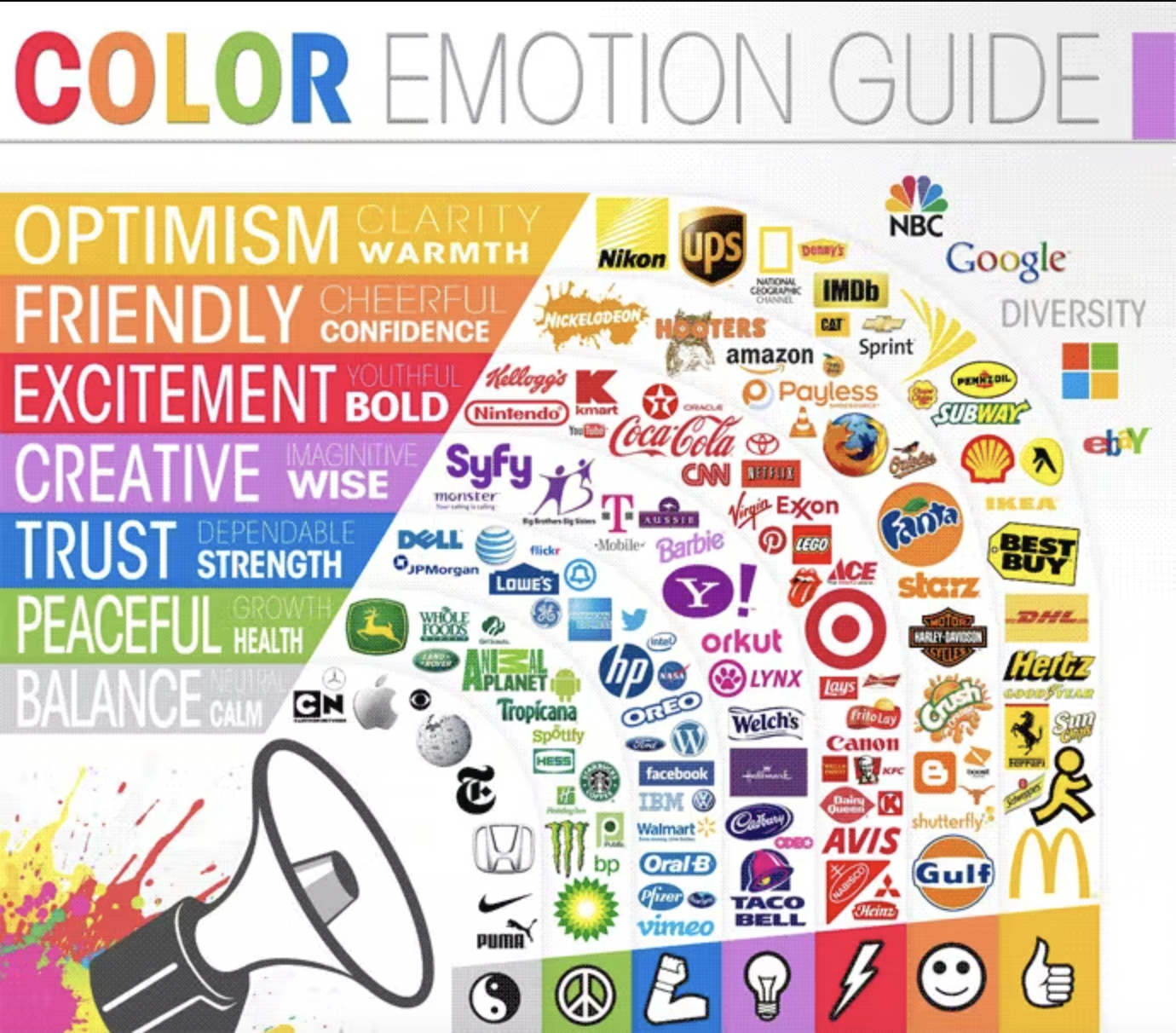
The colours you choose to include in your ad can have a major impact on how users respond to it. Colour can make quite an impression - both good and bad - so it’s important to choose carefully.
Source: The Logo Company
The chart above helps illustrate how different colours convey certain emotions, and which brands have aligned themselves with these colours and themes.
When designing an ad, it’s also important to think about what colours and colour combinations may represent.
For example, green and red are commonly chosen as “Christmas colours,” so picking that colour combination may make your customers think about Christmas - even if that wasn’t your goal!
You can also consider how you can include your brand colours in your ad’s imagery.
Just remember, don’t use too many different colours. When it comes to novice designers, simplicity is always the best option. Choosing one or two colours that nicely complement each other and use them sparingly.
11. Consider Branding
Brands have power. And brand recognition is a powerful tool to help customers, both new and old, find your business and remember your business.
Sometimes, it works well to include a logo or your company’s name right in the design of your ad.
This Dollar Shave Club ad above includes their logo by virtue of including images with their product that have the logo clearly displayed on it.
There are creative ways to include your unique branding without being “in your face” about it.
Remember, most people are using Facebook to connect with friends, watch silly videos, and mindlessly scroll to pass some time. They aren’t necessarily there to shop.
Therefore, it’s important to not be overly ‘salesy’ with your ads. You want to capture attention and quietly convince users that, hey, maybe now is a good time to do some online shopping!
12. use humour in your ads
Speaking of Dollar Shave Club…they are one of the very best brands to use an example of how humour can work super well for you and your brand.
Take a look at the video below.
Funny ads can go viral
Do you remember this ad? You might…because a few years ago, it was everywhere! This viral ad gained tons of online traction because it was funny and non-traditional.
While humour like this might not work for all brands, every business can try to incorporate some witty remarks or a bit of humour into their ads or landing pages.
Well-placed, appropriate humour helps potential customers feel more at-ease. It also helps your business feel more down-to-earth. Many customers today prefer when businesses don’t take themselves too seriously!
13. Think About Stories
Now, our final point is a bit of a double entendre.
When you are designing an ad, you’ll want to think about the story you are going to tell. And one of the best ways to reach audiences right now is by, well, using the Facebook Stories feature.
Source: Wordstream
Facebook Story ads are ads that appear on the “Stories” feature on Facebook. Users can post short video clips and images using this feature, and they stick around for the next 24 hours before disappearing.
Businesses have realized the power of stories - they are captivating, and they are a guaranteed way that users will see their ad. Many companies use video Story ads.
This is a great way to showcase short clips of interesting and exciting content and grab users in with actual stories from your existing customers.
Stories should feel natural since they appear amongst the posts and videos of a user’s friends. So, if you have a story with a customer talking about your business, it will feel “real” and natural.
Check out this guide on how to effectively advertise using Story ads.
Ready To Get Started?
Ready to get started designing awesome ads for your business? Facebook ad design doesn’t have to be complicated - but it should be captivating.
The ideas and tips above are a great way to help you get started making and running ads that work.
However, if you aren’t sure you have the time to spend on creating Facebook ads yourself, consider working with a marketing agency.
At Relevantly, we have over 15 years of marketing experience. Our team has helped countless companies get more leads, grow their businesses, and increase their sales.


